from pathlib import Path
import matplotlib.pyplot as plt
import pandas as pd
from matplotlib.figure import Figure
from example_models import get_sir, get_sird
from mxlpy import Model, Simulator, plot, report
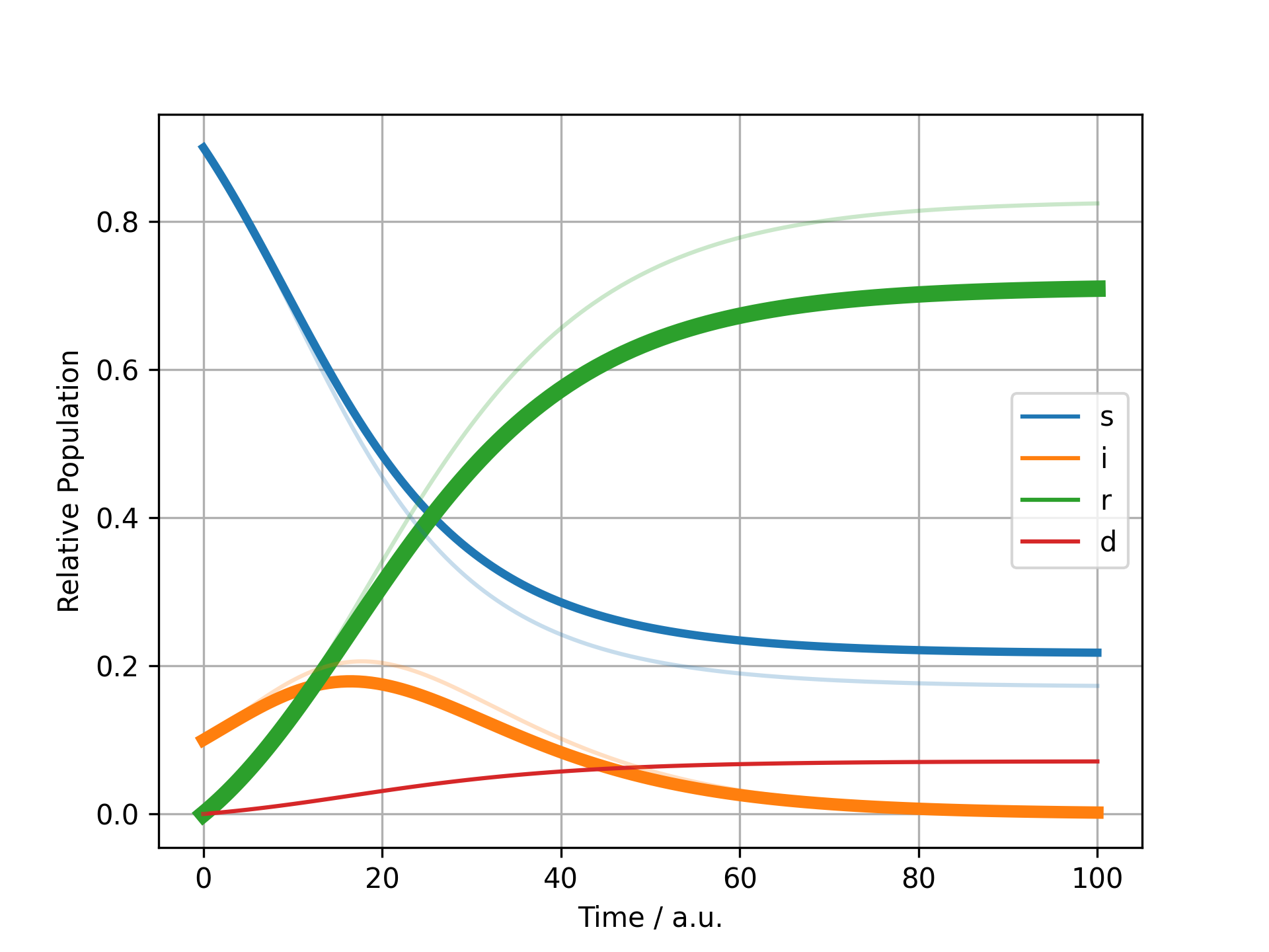
def plot_difference(r_old: pd.DataFrame, r_new: pd.DataFrame) -> Figure:
rel_diff = (r_new - r_old) / r_old
largest_diff = rel_diff.abs().mean().fillna(0).sort_values().tail(n=3)
fig, ax = plot.one_axes()
plot.lines(r_new, ax=ax)
lines = dict(zip(r_new.columns, ax.lines, strict=True))
for f, i in enumerate(reversed(largest_diff.index), start=2):
line = lines[i]
line.set_linewidth(line.get_linewidth() * f)
plot.reset_prop_cycle(ax)
plot.lines(r_old, ax=ax, alpha=0.25, legend=False)
ax.set(xlabel="Time / a.u.", ylabel="Relative Population")
return fig
Reports
To make it easy to communicate changes between two models, mxlpy has conveniece functions in the report module.
By default, the report.markdown function will take two models as inputs and then compare both the structure of the two models as well as numerical differences in dependent values as well as the right hand side.
The report is color-coded consistently, with green referring to new features, orange referring to updates / changes and red referring to deleted quantities.
my_report = report.markdown(
    get_sir(),
    get_sird(),
    m1_name="SIR",
    m2_name="SIRD",
)

# Write the report to disk
my_report.write(Path("tmp") / "report.md")

# Directly display report in notebook
my_report
Report: 2026-06-19
| Model component | SIR | SIRD |
|---|---|---|
| variables | 2 | 3 |
| parameters | 2 | 3 |
| derived parameters | 0 | 0 |
| derived variables | 0 | 0 |
| reactions | 2 | 3 |
| surrogates | 0 | 0 |
Variables
| Name | SIR | SIRD |
|---|---|---|
| d | - | 0.0 |
Parameters
| Name | SIR | SIRD |
|---|---|---|
| mu | - | 0.01 |
Reactions
| Name | SIR | SIRD |
|---|---|---|
| death | - | $i \mu$ |
Numerical differences of right hand side values
| Name | SIR | SIRD | Relative Change |
|---|---|---|---|
| i | 0.01 | 0.01 | 12.5% |
You can further expand the report with user-defined analysis functions that are being run for both models.
Here for example we perform a normal simulation and then plot the time course, highlighting the variables that changed the most.
All user-defined analysis functions have to take two models and the directory where plots are to be stored as an input and output a description in markdown as well as the path of the final image, so that it can be inserted into the report correctly.
def analyse_concentrations(m1: Model, m2: Model, img_dir: Path) -> tuple[str, Path]:
    r_old = Simulator(m1).simulate(100).get_result().unwrap_or_err()
    r_new = Simulator(m2).simulate(100).get_result().unwrap_or_err()
    fig = plot_difference(r_old.variables, r_new.variables)
    if not (path := img_dir / "concentration.png").exists():
        fig.savefig(path, dpi=300)
    plt.close(fig)
    return "## Comparison of largest changing", path


report.markdown(
    get_sir(),
    get_sird(),
    analyses=[analyse_concentrations],
    m1_name="SIR",
    m2_name="SIRD",
)
Report: 2026-06-19
| Model component | SIR | SIRD |
|---|---|---|
| variables | 2 | 3 |
| parameters | 2 | 3 |
| derived parameters | 0 | 0 |
| derived variables | 0 | 0 |
| reactions | 2 | 3 |
| surrogates | 0 | 0 |
Variables
| Name | SIR | SIRD |
|---|---|---|
| d | - | 0.0 |
Parameters
| Name | SIR | SIRD |
|---|---|---|
| mu | - | 0.01 |
Reactions
| Name | SIR | SIRD |
|---|---|---|
| death | - | $i \mu$ |
Numerical differences of right hand side values
| Name | SIR | SIRD | Relative Change |
|---|---|---|---|
| i | 0.01 | 0.01 | 12.5% |
Comparison of largest changing
First finish line
With that you now know most of what you will need from a day-to-day basis about reports in mxlpy.Congratulations!
Placeholders / error handling
In case one of your model functions cannot be parsed by, we will display red warning instead of the actual value.
That way, you can still re-use the remainder of the report.
import numpy as np

from mxlpy import Model


def numpy_fn() -> float:
    return np.exp(0.0)


report.markdown(
    Model(),
    Model().add_derived("d1", numpy_fn, args=[]),
)